skip to main |
skip to sidebar
 Today is the final "design fever" day, and I thought I would close with some tips on redesigning a room.
And just what qualifies me to give tips? you might ask. No, I do not have a degree in interior-design. I have not been on HGTV's Design Star. I've never even known a decorator. BUT...
...I have redesigned every room in my house at least THREE times over! So I think that makes me sorta an expert (or insane, if you ask Craig).
 Before jumping into the tips, I thought I would refresh your memory as to what my office looked like before last weekend. Right away you can see that it was a cluttered mess.
  The walls were brown. The sofa was frumpy. The accessories had run a-muck. And the layout wasn't open.
 Now here is a shot from one angle of the recent redesign. I physically breathe in a sigh of relief when I see the difference. So, how did I get from the dark, dumpy mess above to this? Well, let me tell you:
1. First, I started with a clean slate.
I removed everything but the basic furnishings. I took down the pictures, cleared everything off the desk & table tops, removed the throw pillows and blankets, took away the frames & boxes & trinkets & knick knacks & candles. I pulled down the curtains and cleared off the shelves. And then I pushed the furniture into the middle of room so that I could...
 2. Use paint to set the tone.After the room was cleared, the next step was to paint. Nothing, in my opinion, refreshes a room like a fresh coat in a new color. Plus all of that climbing and stretching to reach tall corners and low baseboards is a good workout. A word on colors...when I first moved into this house I painted every room a different color to suit my mood. Since then, however, I've slowly but surely narrowed down my palette to about a half-dozen choices. And 90% of them coordinate really well. So basically what I'm saying is don't resurrect your fondness for Rainbow Bright when painting. Unless, of course, you like repainting every year.
 3. The next thing I do after painting is to lay a color/style foundation with fabric. As in pillows, rugs, blankets, etc. Because I can sew, I skip the stores and just make slipcovers for all of my accessories myself (probably each pillow in my house has at least 3 covers that I rotate depending on the time of year). And when I get tired of them (which I frequently do), I just switch them out for a new design.
 4. Once I've picked my color/style, I start putting the room back together. This is the point when I usually rearrange things to make the room function better if it hasn't been.
Take, for instance, my office. I used to leave my sewing table open and under the window because that is where the electrical outlet is. But thanks to my hubby's suggestion, I picked up a packet of furniture gliders from the store so that I can move the table over to the outlet only when I need to sew. Now when it's not in use, I just fold it up and move it to a corner, opening up a HUGE space along the wall and window.
 5. Then I bring the accessories/knickknacks back in WITH CAUTION. In other words, I usually leave out at least of half of what was in the room originally
.
So, for instance, though I liked the votive candles on my table, the pictures, the cute little boxes that I keep beads in, the garden pot full of paintbrushes, the corkboards tacked with notes, etc. etc., I didn't bring any of it back into the room. And a week later, I can't say I miss any of it. It's amazing how much clutter we collect, isn't it!
6. Finally, I add the finishing touches--like the pearl chandelier, the floor-length sheer curtains, the faux-wood wall decals, and the grapefruit-scented fragrance decanter on my desk. And I sit back and enjoy...
...for about a season
...until I decide I want to change it again.
What do y'all think of my final design? I think it's a HUGE improvement, but would love your thoughts. Post 'em below!
 Do you see this wall right here? The one behind the sofa? Well, let me tell you a little history about this wall. First off, it is important to understand that this wall is THE accent wall in my office, meaning that it is the very first thing you see when you come into the room. And so naturally I've always felt compelled to make it stand out in one way or another.
My first decision--years ago--was to paint it red. This was back when everyone, it seemed, was having a grand love affair with red accent walls. And so I thought I would join the club. Naturally it was a total disaster and lasted less than a year. I replaced it with a camel/caramel brown, and painted the other walls the same. That is what you see here in the photo below:
 The color was actually a nice choice, but since it was the same as the other three walls, I had to use art to make THE wall stand out.
And obviously failed miserably. I mean, have you ever seen such a hodgepodge of random pieces? Individually I like all of them; together they're a mess.
Needless to say, it was time to start over again from scratch.
 Obviously you can tell from the photos that the first thing I did was replace the camel brown with a grayish-blue. And in spite of what Craig says (I believe "sanitarium" is the word he keeps using), I like it.
Once the painting was finished, I had to figure out what to do with the blank space, and as I mentioned on Friday, I was attracted to the idea of doing wall decals.
Attracted to it, but not nearly patient enough to wait for something to come in the mail. So I decided to design some decals myself using contact paper.
 I spent several hours on Sunday brainstorming design ideas. The above images are a few of the options I considered. I loved the nature-inspired themes that I displayed on Friday, but decided that I needed something to tone down the femininity in the room since the pillow covers, sheer curtains and pearl chandelier were already making a very girly combo. And so shapes trumped leaves, branches and flowers.
 I had a difficult time deciding which design I was going to adopt, and in the end I confess that simplicity persuaded my final decision. Perhaps not as elaborate as some of the options above, my ultimate design was, in a word, EASY. And after 48 hours of painting and sewing non-stop, I was very much in the mood for easy.
 So this little rectangular motif was the winner. It took me all of 30 minutes to create and assemble. And about 99 cents. The only tools I needed were some scissors, a pencil and a level.
I didn't have any rules about spacing, pattern, etc. I just cut a random number of decals in two sizes and started placing them on the wall, eyeballing the distances between them. And frankly after two days of work and a bit of a paint-fume-headache, I'm surprised they turned out as well as they did.
 Perhaps you all might have preferred one of the more elaborate styles I considered, but sometimes (particularly after a long weekend painting) simplicity just works better. Besides, I can always pick one of the fancier designs later and try it out--because that is the beauty of vinyl decals.
But for now I'm just going to admire my 99 cent rectangles and call it a day.
After all, it sure beats the red!
 It has taken me awhile to wake-up this morning. I suppose that my grogginess could be due to the usual Monday malaise. Or perhaps residual fatigue from a weekend afternoon of yardwork. Or maybe...just maybe...
...it's because I completely redecorated my office in 48 hours.
Do you remember this? I posted this "before" photo this past winter as part of my "winter renovation" project. However, as I confessed last Friday, my winter renovation turned into a spring affair. A spring affair that started and ended (well, mainly ended) during the past three days. (translation: I've been busy!) I won't go into the whole makeover this morning, but I definitely will start with the pillows. Though they were not the first project in the renovation, they are the most colorful.
Now, like with most of the designing I do, I tried to stick as much as possible to repurposing things I already had. And these pillows were no exception. A good friend of mine handed these pillow forms off to me at least a year ago, where they've been quietly collecting dust in the basement since.
 Though neglected, I knew that the pillows would come in handy eventually--and Friday was the day.
Now, my top choice for a renovation would be to completely reupholster the sofa, which, unfortunately, is a task that far exceeds my skill level. Therefore, Plan B was to ditch the back-rest cushions that came with the sofa (furniture we inherited from my hub's parents) and replace them with these hand-me-down pillows.
But first I had to cover them.
 Since it is spring, I wanted something that was fresh and light. And something that I could create from my box of fabric scraps. So after some cutting and stitching, I came up with these covers.
At least half of the fabric you see is actually from my old clothing--a pair of khaki trousers that never fit, for instance, and some old shirts in coral and blue. The other half come mainly from fabric remnants I've collected from the craft store over the years for pennies on the dollar.
 The final result, I think, turned out better than I planned. The cushions are extremely comfy, and the colors and design are perfect for the warm months that stretch ahead. Best of all, I got a totally new look for a bargain!
What do you think of my renovation so far?
note: click the images to learn more about these decals from handmade sellers on Etsy.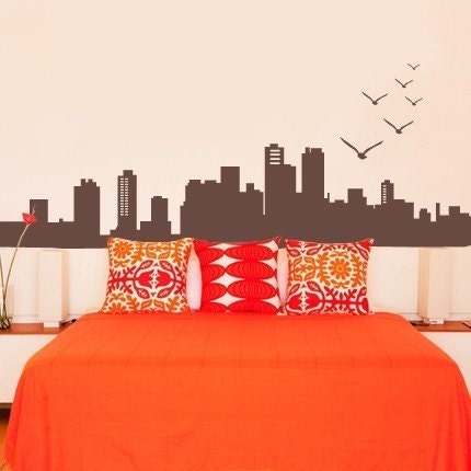 It's happening again. I knew when I first woke up. I could sense it before my eyelids even opened. A perfectly normal day...interrupted. To-do lists were about to go by the wayside. Regular clothes were in danger of being replaced by rags. Why? One simple reason--
The design fever was back. 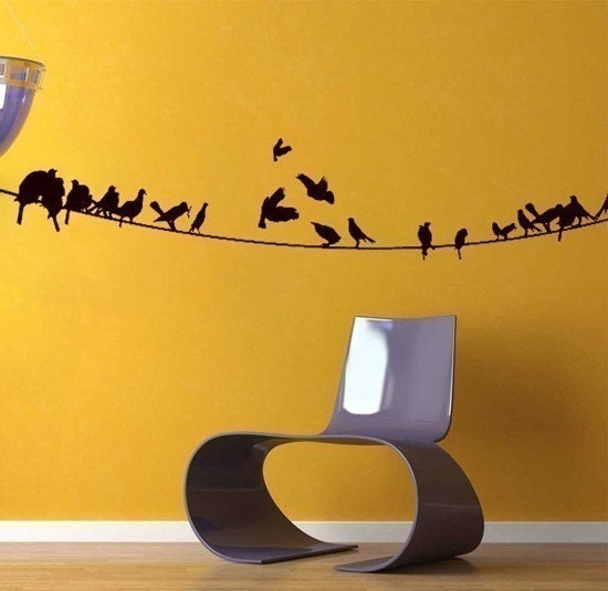 Now, some of you have asked me "hey, whatever happened to that winter renovation you were working on?" Well, apparently the winter just wasn't my time. I had other things to do. What I thought was the fever setting in was just a false alarm. And maybe, just maybe, this is a false alarm too.
But my obsession with wall decals this morning suggests otherwise.
 Yes, yes--I know. I had other plans to paint my office walls. But plans change. After thinking about all of the work it would take to create elaborate designs on my wall, I occurred to me that maybe--just maybe--I should delegate the labor. Like, say, with wall decals.
What do you think?
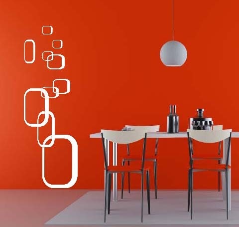
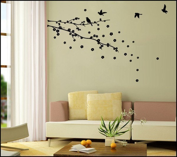 I've selected a handful that I like here, and obviously have some decisions to make. There are some lovely nature scenes, don't you think? The trees and birds? I'm drawn to the delicate leaves. And since it's almost summer, bringing the outdoors to the inside of my office is appealing.
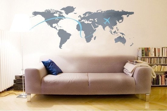 Nature aside, there's another part of me that is drawn to retro shapes, maps and cityscapes. This option would obviously be less traditional & more modern.
 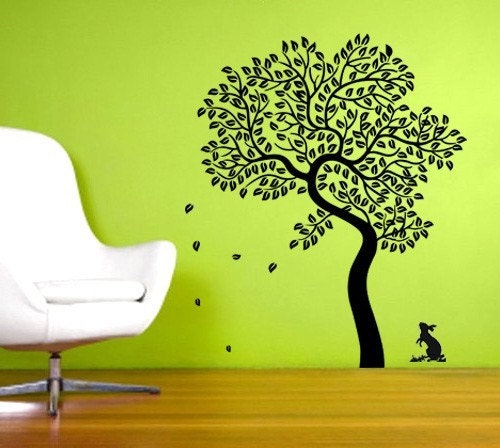 Of course, the whole point of wall decals (in addition to their time-saving appeal) is that you can change them out when you get tired of a motif. So, say, if I want nature for the summer, I can still have retro shapes in the winter. Or cityscapes. Or pine trees (I can't imagine having this last one--but they're available, just in case).
Soooo...what is your preference? Nature? Skyscrapers? Adorable animals? (just kidding--I don't want my office to look like a nursery.) Share by posting your thoughts below!
In the meantime, don't be surprised if I show up on Monday with an entirely different office.
Because that's just how the fever works.
 This week I'm posting on some of my favorite things from the past year. And if you've been following my blog for any length of time, you know that one of my favorite things is to (re)decorate my home compulsively.
Now, before you start to judge me for over consuming, let me at least say that almost all of the images you see above and below are from items that have been handmade by myself or my very handy husband. Furthermore, the majority of them come from materials recycled from thrift stores, old clothing, and pieces of nature. Part of my compulsion for redesign is to match the interior of my home with the changing seasons. For instance, right now I still have pinecones and cable-knit pillows lying around, which isn't very spring-like.
What would be more spring-like would be to swap out those items for some of the ones shown just below--like the lime green pillow covers I made last May to mimic the colors of budding Aspen trees and gray, rainy skies.
 Of course, once spring passes I'll probably pull out some of the items you see in the first collage, like my great-grandmother's quilt and my patchwork pillow shams in red, white and blue (I get a little country-cottage in the summer...). And then I'll move onto the theme below. The smoky tones and woodsy textures always remind me of autumn.
 And finally, a year from now, I'll once again be pulling out my faux fur throws and sheepskin and cable-knit pillows. You know--the ones I need to start putting away now that the weather is getting warmer.
Some people ask me if I'll ever get to the point when my designing is finished and I'm content with things the way they are.
These people obviously don't know me very well...
Do you do any seasonal redesigning? Share your favorite spring decorating tip below!
 Now that I've at least figured out the lighting and the feature wall design for my office makeover, I'm moving on to the floor. Frankly it is an area I tend to neglect by leaving it bare. But I remember a designer once saying that the floor is as important to "decorate" as the walls of a room, and so I'm trying to reform my ways.
Thus...the following images are ideas I'm tossing around for a rug design. I'm considering a variety of patterns and textures, and have ambitious plans to craft a 4x6 floor covering myself using a common rug pad and some cotton yarn.
 And as with the walls, I could use a little guidance. I'll start with texture options, and then move onto patterns.
The first texture option is one I'm definitely interested in--a basic shag. I feel that it would coordinate well with my retro theme, and provide some visual interest. However, I'm not sure it would add enough textural contrast between the carpet (which has a medium loft) and the rug. What are your thoughts? Do you like the shag style?  The second texture option is braided and/or woven. I Love the above rug from Room and Board, and could probably experiment with the braiding technique. This option is decidedly less "fluffy," but perhaps more sturdy. Do you have a preference?
 Moving on to pattern, I have a few ideas I'm tossing around. For instance, this first option, above, incorporates my "chandelier" design in the flooring (I opted out of this motif for the walls in favor of interlaced circles). I'm not sure it would translate well onto a rug, but I'm certainly open to trying if it's a favorite!
 Or I could introduce some stripes into the room. For this design I would use a combination of salmon, brown, and ivory--with perhaps a few thin stripes in additional colors just for variety. Stripes are admittedly common, but also timeless. And definitely they would make for easy construction.
 Finally I could opt for something very basic. These circles are quite similar to those that will go on the wall, and overall this style is minimal. Most likely the dominate color would be a salmon pink (mainly because that is the color I have the most yarn in...), but the colors for the other features could be changed for other choices.
Noticeably absent in these choices is a traditional Persian style (because frankly I think I'd be out of my design league on that!) and a floral motif (although you might be able to talk me into the latter).
So what do you think? I'd love to hear your thoughts on which texture and which pattern you like the best! As always, thank you for your creative input! I look forward to hearing from you!
--steph
 Friday afternoon my husband came upstairs to find the vacuum in the middle of the bedroom, the sheets stripped from the bed, and a strange noise coming from the office.
It was not a crime scene. It was me...sewing. Yes, I was right in the middle of cleaning. And yes I abruptly left everything half finished in order to make a new cover for our bed. Because after not making my bed for nearly a month, I came to realization that I didn’t like the way it was decorated. So I needed to change it. Immediately.
 As you can see, the result is not fancy. Or even girly. There is a reason for this. Just because I’m a lady doesn’t mean that I condone excessive frilly-ness. I do, after all, live with a man. I can’t have him residing in a house that screams “miss priss” at every turn. So while I do certainly indulge in flagrant femininity with my clothing, accessories, hair styles, etc., I tone down the estrogen in our home.
 Without getting too freshman-psychology-101-course on a Monday morning, I will say briefly that this strategy highlights an important element to consider about being a lady, which is that femininity shines the brightest when compared to its counterpart--masculinity. I, for instance, look my most ladylike when standing next to my husband, who wears denim and t-shirts everyday and has had a goatee since he was 18.
  What I’m trying to say (somewhat laboriously, I might add--sorry for that...)is that the whole boy-girl combo works generally well in a lot of areas in life, including fashion and home design. And furthering the species, of course. This is why J.Crew does such a marvelous job at the whole “glamorous tomboy” look. And why leather looks great with crystal chandeliers. And why I wear men’s cologne throughout the winter with shimmery camisoles and high heels. (seriously--I do. You should try it sometime.)
 And it is why I bought 5 yards of this soft flannel fabric months ago knowing that eventually it would make its way into our decor. Because the girly touches always look best when there’s a little manliness around.
And yes--I did finish my cleaning just in case you were worried.
What is your favorite "tomboy" touch? Share by posting your comment below!
 This past weekend, while enjoying a leisurely Saturday, I encountered an old article I had stashed away featuring a select handful of fashion industry leaders. The article, titled "Women in Luxury," was something I had clipped out years ago because I found it inspiring. The women, I felt, possessed a unique blend of business savvy, strength, and femininity.
  Upon reading through the article again, I was struck by one particular statement made by Valerie Hermann at Yves Saint Laurent. She said that though she grew up in the midst of a culture of science and medicine (many of her family members are physicians), she was always attracted to an atmosphere of "quality and beauty." That's it! I thought. That is precisely what I'm attracted to! The latter part, beauty, is of course easy. I've always gravitated toward lovely places and pretty things. As for quality...well that has taken me a bit longer to appreciate.
 Quality, I've come to realize, is not as easy to spot. Something can indeed be beautiful but of poor quality (think of cheap cashmere and vapid runway queens). This, I fear, is especially true in our modern world of mass-produced fashionable, convenient and "affordable" goods. "Affordable," of course, meaning "cheap"--both in price and in quality.
Now I'm not suggesting that in order to be a lady we must all start spending oodles of cash on only the finest things. Because although that would be simply wonderful, most of us can't stomach the expense. But I am saying that beauty and quality should go hand-in-hand as often as possible.
 For me, this involves creating more of my own clothing, gifts, food, and home accessories using materials that are special. Like the soft yarn you see below. Or the pencil skirt I sewed last week. Or the farm-fresh milk we drink every morning from cold glass jugs. They are luxuries--little ones--that make up that "atmosphere" Hermann was referring to.
 Of course, additionally it also involves combining my outside appearance with my internal character (both are always evolving and...frankly...requiring constant maintenance). I don't just want to be a beautiful person--I want to be a quality person, too. Someone who is generous and kind and patient and persevering. Someone who is not wasteful or crude.
Because good character, I suppose, is one of the best luxuries a lady can have...
What is your favorite little luxury this week? Mine is definitely the super soft merino and baby alpaca yarn that I purchased last Friday. And also perhaps those chocolates you see above, too. A girl needs her chocolate... How about you? What are you enjoying?